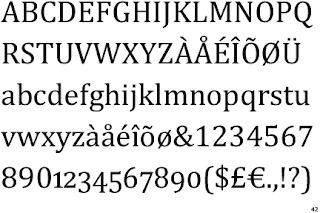
WORKING WITH CAMBRIA TYPEFACE

Say hi to


Cambria Regular is the default serif font in Microsoft Office 2007. It was designed by Jelle Bosma, Steve Matteson and Robin Nicholas. The purpose of this typeface is to give a clearer on-screen depiction. Fonts similar to Cambria are Diverda Serif, Eidetic Neo, Karmina and Prensa. This typeface is distributed with Windows Vista, Windows 7, Microsoft Office 2007, Microsoft Office 2008 for Mac, and Microsoft Office 2007 viewers and converters. The typeface publisher is Microsoft Typography.

I’ve always liked this typeface; I’ve used it for everything from term papers, emails, business documents, web designs to presentations. Cambria has a “sturdy” appearance to me. I feel like it’s an accurate reflection of how I want majority of my work to be conveyed. Unlike the casual feel of Times, Arial, Helvetica or Century Old Style just to mention a few, it comprises simultaneously of the most important characteristics: formality and solidity. This typeface to me is seen as something strong and serious, yet not too stern that it scares away the audience.

Coupled with external research on typeface, I’m going to be using Kathleen Burke Yoshida’s article on “Avoiding Typeface Terrors” to help analyze what technical communicators should consider when selecting a typeface. The article discusses test requirements to ensure communication is in a clear and creative manner. This post is going to concentrate on the following typeface topics:


  1. Legibility (the clarity of the letters) In the article “Avoiding Typeface Terror”, Kathleen refers to legibility of a typeface as the degree of the letters recognition. In other words, how legible the letters are whether they are standing alone or are in combination with one another.

Let’s determine if Cambria passes the legibility requirement. To determine legibility for Cambria, place a piece of paper over the top or bottom half of the words. If you can read the words easily by just looking at half of the letters, then Cambria is likely perceived as legible.

Notice that I mixed the type size, variation and included numbers in the graphic above. This I believe will better create a more diverse foundation to answer the question. I can make out each word and number, whether the top or bottom half is covered by a piece of paper. Therefore, Cambria passes the legibility test. Now let’s try readability.


  1. Readability (the ease of reading the letters)

I know you may be wondering what the difference between legibility and readability is, but these are two distinct typeface considerations. Unlike legibility, readability according to Kathleen refers to how easily the typeface can be read. Take for instance, the above Cambria graphical text representation. We are going to determine if the typeface passes the test using format elements such as: white space, type (point) size, and typeface variations.

a. White Space – This refers to how easily the words breathe, and if they have adequate white space separating each other to make the text readable. Keep in mind, that too much space will impose a problem on the readability of the text. On the other hand, too little space will cluster the text therefore making it difficult or impossible to read. In my opinion, Cambria excels here too, it has very even spacing and proportion.

b. Type Size – This refers to the point size you select for your text. In my opinion, Cambria has a strong feel to it already, therefore you need to be very careful when choosing font size. I usually use 12-point for most body text. This I feel is legible and readable enough to avoid complications.

c. Typeface Variations – This refers to elements such as italics, bold, all caps and underlines. Above, Ive displayed a variety of Cambria text in bold, italics, all uppercase etc. Obviously the text is very much readable here, which means it passes this test. However, like stated above Cambria has a strong appearance, so bolding letters or words should definitely be used when necessary.


  1. Personality (the feeling conveyed from Cambria)


The article does not explicitly state a test used to determine a typeface personality. However, it explains that a typeface should complement rather than distract one from the document’s purpose and message. I agree with Kathleen when she says “A typeface’s personality is ultimately determined by a reader’s perception”. I would classify Cambria in general as a conventional typeface. This is because of its formal appearance that this characteristic makes it appropriate for business documents. It also can be used for any long text like; term papers, novels, books and the like. I would prefer to refer to Cambria as the “all purpose body typeface”.


References:

Yoshida, B. Kathleen “Avoiding Typeface Terrors” - http://www.stc.org/confproceed/2000/PDFs/00006.PDF

http://www.identifont.com/find?font=cambria&q=Go

http://www.poynter.org/column.asp?id=47&aid=78683

http://en.wikipedia.org/wiki/Cambria_(typeface)

WEB DESIGNS REFLECTED UPON AGE

I am going to analyze how two different websites that serve the same purpose take completely different approaches using style, layout and navigation to attract their audience. I will begin with The Kidz page (http://www.thekidzpage.com/freekidsgames/index.htm), a game website specifically intended for children between the ages 5 to 15. Pogo (http://casino-games.pogo.com/) another game website distinctively directed to adults. These websites serve the same purpose to amuse their audience, pastime or serve as some form of entertainment. These websites definitely achieve these purposes; they define their targeted audience and present the correct graphical orientation on their site to attract said visitors.


Looking at the Kidz page you can see how colorful the website is, mainly to attract kids. The page displays so much color and animations to keep a child’s eye focused on the page. I feel the reason the writing on the homepage is so small is to avoid the child from getting distracted with the words on the page. Take a look at how conspicuous their website is. Also, every page on their site is as brightly lit like this color.


On the other hand, pogo has a much calmer look and feel. Clearly they know that color is to say the least quality that is going to attract their audience. However, they try not to make it to dull and they do this by adding the appropriate graphics like board, word, puzzle and casino animations. I feel like this is to inform the audience of the category of games they have, which I believe is something imperative to include. Also, I noticed that unlike The Kidz Page which has advertisements that lead to other kids game websites; Pogo has advertisements on their site that are more adult inclined. In the sense that, the advertisements on their site are either travel sites, insurance sites, government foreclosed properties and the like.

In comparison to the kid’s website, I noticed pogo like so many other adult games sites I have come across like: http://www.worldwinner.com/cgi/start.pl, http://www.rewardtv.com/welcome/sampleGames.sdo, or http://www.shockwave.com/online/all-games.jsp requires that the visitor registers to play a game. All kids site l looked at like: http://www.smartycard.com/tp/home.html, http://www.gamesxl.com/, or http://www.cloudywithachanceofmeatballs.com/ did not require it mandatory to register prior to playing a game. Let us take for instance pogo; you can either sign up free or play as a guest. Either or they require a substantial amount of information from the visitor. Like name, email address, username, password and/or membership fee. The nature to create an account depends on the terms and agreements of the site, the information asks varies per site.

A kid is not going to want or have the patience to fill in such information. It’s already known to the web designer to just take the kid directly to what they want. If not there’s a skewed possibility that the child will lose interest in the site all together. An adult on the other hand, has the patience and knowledge to fill in the information.


Take for instance www.smartycard.com, a kid’s website that I feel is one of the few sites a child will actually enjoy registering. The first thing to do to register as a user is to choose a character (which is an animation),

Then grade level (another animation) …

Then it takes you to your page …

If you want to exit, it then prompts up the option to save. You click ok, then it asks for your name …

Username …

Password …

Amd parent’s email..


I liked that they made registering fun for kids. A very smart approach, too keep the kids focused on the site regardless. Another design aspect that I feel is relevant to discuss is sound. These two sites lacked sound as an essential marketing technique to include in their site. It’s understandable that excessive or unnecessary sounds can agitate an adult, but I feel it’s an element to include in the Kidz page. Although a few games had a little sound to an extent, I feel it is an adjustment to make. Finally, I feel the web design of these sites blended well with the business marketing concept. The design of the website just at a glance definitely communicates to whomever, who their targeted audience are.

Reference:
"Characterizing Audience for Informational Web Site Design" By: Turns, Jennifer; Wagner, Tracey S.. Technical Communication, Feb 2004, Vol. 51 Issue 1


"Every child is an artist. The problem is how to remain an artist once he grows up."
— Pablo Picasso


PRINTING WITH TYPE


I believe that before the beginning of any discussion or debate a general definition or introduction should be given. According to the latest Encyclopedia Britannica core definition of typography is that ‘typography is concerned with the determination of the appearance of the printed page’. In short, typography is the art of print. Typography comes from the Greek work Etymology, meaning typos—type, graphos—written. The video above is an example of how font’s size, texture, shape, color and movement express the meanings of words. My objective is to write about the LANGUAGE and ELEMENTS of this video’s design.


In terms of language, my aim is to write about this video as a visual design or vocabulary. In other words, understand how the text is meant to communicate it’s meanings to us. Let’s start with the choice of font(s) used in this video which is the primary aspect of typography. The text used composes a message that is readable and coherent aimed at producing clarity in whatever meaning the text is trying to signify. If you notice the video at the beginning displays its words a little less obvious in size than at the end. The words become bigger which I think helps establish hierarchy in the video.


Looking at the first word in red, “pain” expresses importance in its meaning. Pain, in any connotation is defined as something bad or distressing. This is only normal as to the reason why the author of this video expresses the word in red. For instance, the word pain in comparison to the first three words “Take me away” creates variety. In the sense that pain, creates visual interest and awareness to the audience. Not only is the word in red, but the word is somewhat shadowed with lighter versions of the same word above and below, balancing the visual contrast. These different types of looks of the same word when in combination carry the same meaning across - pain.


Color produces the sense and resonance to the subject matter which imparts yet another important feature of typography. The interplay of a black background creates unity during the movie. This is because; black brings out almost any color so it is safe for any text size to be visible. For example; when the blinking red word “hurts” comes in with the small text underneath, displaying at a rather fast speed word for word – Death is the only freedom; the text is still very much visible. This black background controls the variety of text used. Further along the movie when the size of the words became bigger and uses various font styles and sizes but still remains clear, it is only evident that the black background complements the text appropriately. Also, I feel like when the text starts using bigger font sizes it shows the movie is coming to an end.


In reference to the elements of this video’s design, I am going to examine the various graphics and techniques used to support this video. Garr Reynolds could not have helped explained my first point any better. In his article “10 Tips on How to “Think like a Designer”, his number 7 tip - Think communication not decoration, he talks about how design including graphic design is not all about beautification. However, design is about solving problems, making the current situation better than before and most importantly communication.


This takes me to the format and orientation used in the movie which is a plain black background. Although the black to some might seem dull and uninteresting, I feel the creator was trying to get an important message across – the words. I think the black background kept the audience attention on the words and did not distract them by a colorful background.


The views of my eyes were solely focused on the words on the screen. As the words appeared slowly at the beginning of the video, my focus and eye movement were slow. Further moving along to the end of the movie when the words started appearing at the top left then to the bottom right of the screen the movements of my eyes changed accordingly. For example, the words – “Waiting for you”, “I am lost” “I am cold”, “You are my heart” and “You are my soul” pulled my eyes towards a diagonal view to the words in comparison to the rest of the words in the movie.


The contrast of this movie though short was very decisive; there is enough variety through the color, layout and texture of the text. I feel this movie presented enough visual communication by conspicuously presenting important words. The movie persuaded the audience to view all persuasive words like “pain” by complementing it with color and style. It also translated this verbal language to visual form by unknowingly capturing the audience attention.


You didn’t think I wasn’t going to discuss the music used in the video, did you?
Yes, the melody of the music used only added to the beauty of this work. If you notice, at the beginning of the video the melody of the music was clam in accordance to the subtle text. Somewhere at the middle of the movie, where “Not an option” came into play the rest of the words from there took another turn. As the words increased in size and the speed became faster, the tune of the music elevated in volume.


I listened to the entire video a couple of times without the music. Although the experience wasn’t entirely the same in comparison to watching the video with music, there wasn’t that much difference. I felt that the major words emphasized still stood out to some extent. Even though the sound definitely produced a more effective take, I could still communicate visually noticing and observing the key elements.


Here’s a link to Garr Reynolds article “10 tips on how to think like a designer”
http://www.presentationzen.com/presentationzen/2009/08/10-tips-on-how-to-think-like-a-designer.html
Happy Read


"Everything you can imagine is real."
— Pablo Picasso


MICROSITES STANDING


I've always wondered what the difference between corporate sites and their blogs are? Standing by themselves I wonder if they depict something different? I decided to analyze two different kinds of corporate blogs that reflect different concentrations, opinions and thoughts. GM (http://fastlane.gmblogs.com/about.html) - one of the biggest US automotive industry and ADOBE (http://blogs.adobe.com/) - a multimedia and creativity software company. These are two different companies that inevitably want to reach their organizations goal.


GM FASTLANE BLOG

Their intended audience for this blog is targeted towards prospective auto buyers, shareholders, investors and designers. The goal of their blog is to discuss the development and design of their current and prospective products and services. They also discuss other important issues the company is facing; be it social, political and otherwise. Also, they share ideas and inventions.

I appreciate that they encourage not only questions but criticisms and comments. They even have something called the GM Lab (http://thelab.gmblogs.com/) where contributors (anyone) can enter into an interactive design research. Although they hide certain ideas from their competitors, they encourage ideas on products that need a little extra tweak or anything in general. All the comments posted on their website are displayed excluding comments that are off-topic, spam or defamatory. They reply comments and provide the appropriate corrections where necessary and disagree with some respectfully. Average entries are not more than 600 words, some entries run much shorter depending on the topic. More than 90% of their entries include videos in relation to the topic to better elaborate on the subject. Therefore, because most entries include videos of some sort there is not a lot of visual design on the site. However, the blog is not at all filled with dull colors but rather goes with the simple white background for simplicity and soft touch that visitors can recognize immediately. There is a distinguished line used for the header of their page which includes their logo and underneath the line their mission statement. Their search engine, contributors, recent comments, links and etc are neatly arranged at the right-hand side of the page. My overall feeling of this blog is the company’s unique style to communicate with customers. I feel their bringing their own set of opportunities for it’s users to have a positive experience. I like that they discard posts that do not add value for readers. Also, I like that they include the names and position of employees who add entries.


ADOBE BLOGS

Adobe’s intended audience are their customers and potential customers. The content posted on their blogs solely have to do with updates and news of their products. Their goal is to educate their buyers on the development and inform them on the latest news on their products and services. Although the site allows comments; on the homepage of their blog with over 20 posts there is not a total of 25 comments. Average entries run from two to three paragraphs. Their visual design is simply laid out with a white background and black text that lacks visual appeal.

The overall corporate image to me in this blog design, is that of a very basic look.I would have expected a major company like this to provide the opportunity of executives/employees the chance to communicate openly.

In conclusion, my opinion on corporate blogs is really a way these companies can strengthen their relationships with important target groups as industry experts. However, isn't that the intent of blogs? To serve as a tool for communication with the public, collaboration, demonstration of corporate responsibility, reputation management, promotion of product and services and knowledge management.

RESOURCES:

http://www.businessweek.com/the_thread/brandnewday/archives/GM%252520Logo.jpg

http://tinycomb.com/wp-content/uploads/2008/12/adobe-logo.jpg

http://www.smashingmagazine.com/2009/08/20/corporate-blog-design-trends-and-examples/


"We don't see things as they are, we see them as we are."

WHY DO YOU BLOG?

A year ago when I just commenced my Msc, the focus of my Knowledge Management and Management Strategies of e-commerce courses, initially was centered on creating mission statements for fictional companies. I remember writing one mission statement after another – to best suit my targeted audience. It was obvious then as it is now that, having a mission statement is an imperative place to begin any good venture. This blog is going to be an environment where I can think, reflect and plan on how effective technical communication is seen visually. Also, this blog will educate me by perfecting my knowledge through gathering the input I need by researching for my output. This will be a place where I can play with technologies and ideas. Why do you blog? I found this interesting website, in case YOU need a reason to blog. http://scienceroll.com/2008/11/12/do-you-need-some-reasons-why-to-blog/  

Has anyone heard of: Let Me Google It for You - LMGIFY (http://lmgtfy.com/). Take for instance those people who rather prefer to drain you with questions than just Google it themselves; here’s a convenient tool for you. For instance, someone wants to know NJIT’s location and won’t invest the three seconds to Google it - send them this link: http://lmgtfy.com/?q=njit+location.  


"The man who does not read good books has no advantage over the man who can't read them." 
— Mark Twain